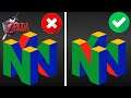
Wrong Nintendo 64 Logos in N64 Commercials


In this Video I look at various Nintendo 64 commercials that got the 3d spinning Nintendo 64 logo wrong.
Please check out this video if you would like to know why companies get the logo wrong and why the right logo is correct
https://youtu.be/x1HIvYi_A9Y
Note: (Ocarina of time commercial). The commercial in this video is a remake of the old commercial the old commercial uses the exact same colors though you can look at the old ocarina of time commercial here.
https://youtu.be/CG96iepExc4
Picture proof that the remade commercial uses the same logo as the original commercial
https://imgur.com/a/BAQqOGz
The games with the incorrect logos are
Ocarina of Time (All top Faces are wrong)
Super Mario 64 (uses all red faces on bottom)
Wave Race 64 (uses all red faces on bottom)
EarthWorm Jim 3d (uses 2 green faces on bottom)
Pokemon Stadium (uses 2 green faces on bottom)
Mario Party 1 (uses 2 green faces on bottom)
Mickey Speedway (uses 2 green faces on bottom)
Super Smash Bros (uses 2 green faces on bottom)
Nintendo's own guideline for using the N64 logo
===
Proper Use of the N64 Logo
The following rules should be followed when using the N64 Logo.
____ For broadcast and game video, it is acceptable to use a black background behind the logo, with the "Nintendo 64" text appearing in white.
____ Logo colors should match as closely as possible the colors of the logo as it appears in static/printed form. Following are the RGB colors for the N64 logo:
Red: R196, G0, B38
Blue: R56, G56, B127
Yellow: R242, G171, B0
Green: R63, G162, B68
____ When spinning, the logo should rotate to the left (counterclockwise when viewed from the top) at about 16 RPM (one revolution per 2 seconds.)
____ The camera viewing angle must represent the "N" cube exactly as it appears in printed form. The sides of the logo should be parallel and the logo must not appear warped, such as with a "fish eye" lens.
____ Other camera movements, flybys, etc. can be used as long as the correct angle and orientation of the logo is used to establish the identity at some point in the sequence.
____ It is critical that the proportions of the "N" cube accurately reflect those of the printed version of the logo. The size relationship of the "N" cube to the "Nintendo 64" text should be maintained.
____ The "Nintendo 64" text should be placed above the "N" cube logo and the correct font must be used. (An Alias file of the logo is available from Nintendo Licensing Support.
Note: For additional information regarding the proper use of the N64 logo, please review the "N64 Logo and Application Rules" sheets included in your Software Development Kit.
===
#n64
#n64logo
#wrong
Merch
https://www.youtube.com/channel/UCIajM7KQQ8wjOJ-aMnFealQ/store
Twitter
https://twitter.com/snooplax
Other Videos By Snooplax
| 2020-10-05 | Super Mario 64 but its an Arcade Fighter |
| 2020-10-05 | Frogger in Super Mario 64 |
| 2020-10-03 | Sonic Marble Zone In Super Mario 64 |
| 2020-10-03 | Hazy Maze City |
| 2020-10-01 | SM64 Castle Destroyed |
| 2020-09-29 | SM64 Crystal Caverns (Metal Cap Course Remake) |
| 2020-09-28 | SM64 Castle Remix |
| 2020-09-27 | Snowman's Land Remade |
| 2020-09-27 | Banjo-Kazooie Intro Green Screen |
| 2020-09-24 | Super Mario Sunburn (What Sunshine Should Have Been) |
| 2020-09-21 | Wrong Nintendo 64 Logos in N64 Commercials |
| 2020-09-18 | MarioWare 64 |
| 2020-09-16 | Super Mario Sunshine Hacks |
| 2020-09-13 | Exploring an Alternate Super Mario 64 Castle |
| 2020-09-11 | Super Mario 64 But All The Levels Are Combined Into 1 |
| 2020-09-08 | Bowser & Giga Bowser In Smash 64 |
| 2020-09-05 | Mario Kart 64 Custom Tracks |
| 2020-09-04 | Kirby 64 The Crystal Shards Bob-Omb Battlefield Mod |
| 2020-09-03 | Super Mario Star Road Stream On Console |
| 2020-09-01 | Super Smash Bros Melee 64 |
| 2020-08-31 | This Mod Is "The Missing Link" Between Ocarina of Time and Majora's Mask |
Other Statistics
The Legend of Zelda: Ocarina of Time Statistics For Snooplax
Snooplax currently has 240,105 views spread across 19 videos for The Legend of Zelda: Ocarina of Time. There's over 2 days worth of watchable video for The Legend of Zelda: Ocarina of Time published on his channel, roughly 4.85% of the content that Snooplax has uploaded to YouTube.