Over 1/3 of 3D Nintendo 64 Logos are WRONG When Spinning


In this Video I look at various Nintendo 64 logo models that are incorrect.
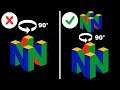
Q:
The official logo is wrong according to this video
A:
The logo in the thumbnail and the logo at 2:13 is the official N64 logo but turned 90°. (at 2:13 You can even see The official logo with The ones that are rotated) The official logo you see on your console and the official n64 logo art are right. The official logo artwork has green N on the left and blue N on the right. From this angle 2 red faces can be seen(1 on top and 1 on bottom). From the official logo 1 green face can be seen on the top portion and 0 blue are seen on the bottom. This is where misconception of the logo having all red faces comes from. When we rotate the logo 90° so that Blue is on the left and green is on the right this is where the confusion comes from. Since Nintendo didn't have any pictures from this angle. When modelers were tasked with making a 3D Nintendo 64 logo some made it wrong. The bottom of the logo is supposed to have 2 red sides and 2 blue sides. This is because the top has 2 red sides and 2 green sides. Using 2 red and 2 blue was used so there wouldn't be too much green. The reason that it looks off is because at that angle it shows only 1 face of red instead of the 2 that we are used to seeing from the official logo.
Q:
If Nintendo Never released the logo from that angle how do you know that using blue is right.
A:
The official Nintendo 64 DD start up screen used Blue. Every Game that features Nintendo characters also used blue too. These games are Majora's Mask, Ocarina of time, Diddy Kong Racing and Donkey Kong 64 . Banjo-Tooie fixed the mistake of Banjo Kazooie and made the logo blue instead of red. Also out of the 25 Games that use an Nintendo 64 model 15 use the right blue model and the other 10 use the wrong logos talked about in this video.
N64 logo stats
Mistake Percentages
30% by using all red on bottom
50% by using 2 Green on the bottom
10 by uses 3 red faces on top and bottom instead of 2
10% by uses 2 extra red faces on the inside N portion
The games with the incorrect logos are
Aidyn chronicles (use all red faces on bottom)
Banjo-Kazooie (uses all red faces on bottom)
Clay Fighter 63 1/3 (uses all red faces on bottom)
Conkers Bad fur Day (uses 2 green faces on bottom)
EarthWorm Jim 3d (uses 2 green faces on bottom)
Lego Racer's (uses 3 red faces on top and bottom instead of 2)
Powerpuff Girls Girls Chemical X-Traction (uses 2 green faces on bottom)
Tetrisphere (uses 2 green faces on bottom)
Tom and Jerry (uses 2 green faces on bottom)
Top Gear Rally 2 (uses 2 extra red faces on the inside N portion)
Nintendo'd own guideline for using the N64 logo
===
Proper Use of the N64 Logo
The following rules should be followed when using the N64 Logo.
____ For broadcast and game video, it is acceptable to use a black background behind the logo, with the "Nintendo 64" text appearing in white.
____ Logo colors should match as closely as possible the colors of the logo as it appears in static/printed form. Following are the RGB colors for the N64 logo:
Red: R196, G0, B38
Blue: R56, G56, B127
Yellow: R242, G171, B0
Green: R63, G162, B68
____ When spinning, the logo should rotate to the left (counterclockwise when viewed from the top) at about 16 RPM (one revolution per 2 seconds.)
____ The camera viewing angle must represent the "N" cube exactly as it appears in printed form. The sides of the logo should be parallel and the logo must not appear warped, such as with a "fish eye" lens.
____ Other camera movements, flybys, etc. can be used as long as the correct angle and orientation of the logo is used to establish the identity at some point in the sequence.
____ It is critical that the proportions of the "N" cube accurately reflect those of the printed version of the logo. The size relationship of the "N" cube to the "Nintendo 64" text should be maintained.
____ The "Nintendo 64" text should be placed above the "N" cube logo and the correct font must be used. (An Alias file of the logo is available from Nintendo Licensing Support.
Note: For additional information regarding the proper use of the N64 logo, please review the "N64 Logo and Application Rules" sheets included in your Software Development Kit.
===
All game play was captured with an Gv-usb-2
#n64
#n64logo
#wrong